ShopDreamUp AI ArtDreamUp
Deviation Actions


Suggested Deviants


Suggested Collections


You Might Like…


Comments8
Join the community to add your comment. Already a deviant? Log In
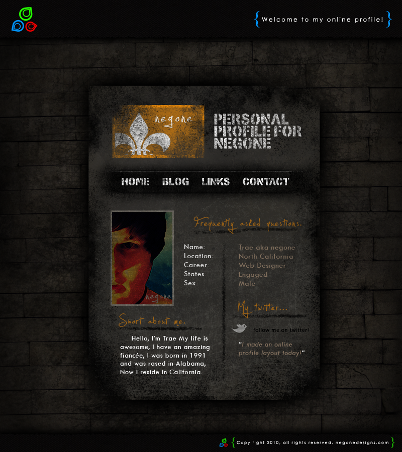
You should pull the brightness off the orange in the logo into the section headers... brighten up those titles yo.
Also, try making the text under the "about me" section the same color as the text next to your picture. It seems a little brighter and just doesn't sit well for some reason.
Other than that looks great. I'm interested to see what you'd do for the actual portfolio portion of the site.
Also, the way you utilize the dark colors for the site work well and I would keep it that way. It's not too dark that it puts people off from looking at it, which is always nice.